Pantone’s much-anticipated colour of the year for 2023 is the joyful Viva Magenta, a shade that encourages fearlessness and self-expression without restraint.
Viva Magenta falls into the red colour family and is described by Pantone as promoting a “joyous and optimistic celebration.” When you think about this shade for clothing and accessories, it makes perfect sense.
But what about using Viva Magenta in interior design? If your initial thoughts are that it might be quite a difficult shade to include, you’re not alone. We asked FCI London interior designer to share some ideas.
Viva Magenta in Interior Design
“First things first, let’s acknowledge the link between Viva Magenta and the rise of Barbiecore. The colour pink experienced an atomic bomb level of explosion in 2022 and it’s showing no signs of abating. Pantone’s Viva Magenta hops firmly on that bandwagon. Whether you love it or hate it, you can’t deny that it only seems to inspire strong feelings; there’s no ambivalence here.”
While we expect to see this shade splashed like smashed raspberries across catwalks and in major department stores, the raspberry-like colour is tricky to use in home decor.”
How to use Viva Magenta in your home
“We’ve seen an increase in bolder, more saturated colours in home decor and accessories throughout 2022 and we expect this to continue into the new year. There’s a particular focus on reds, mauves and pinks, all warm colours with a dramatic flair.”
“A key tip for using a saturated shade of red is to use it in small doses in places where you want to add energy to a room, like on a dining table or a kitchen island. Try a magenta tablecloth or runner, or hang raspberry-hued artwork in these spaces to lift the entire room. Magenta flowers in a white vase and magenta candles will add striking yet controlled elements to tables and workspaces. Remember that a little goes a long way.”
“For other areas of your home you may not want to upset the balance of colour harmony, so magenta is not the best shade to incorporate. Try using it in accents that don’t affect the aesthetics of a space, like a front door, throw pillows or even outdoor flower planters.”
“Another good option is to cheat a little and use Viva Magenta-inspired shades, but choose deeper and more muted options so the contrast isn’t as jarring. Blackberry, merlot and carmine allow you to derive the energy of the colour family without as much drama.”
Viva Magenta by room
Lauren shares her top tips to incorporate the Pantone colour of the year in each room.
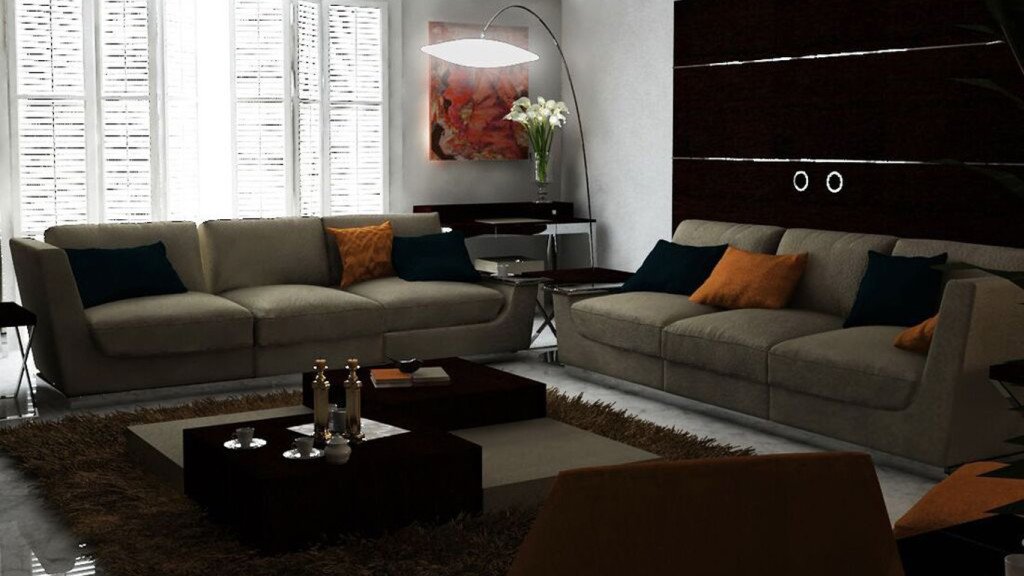
Living Room
“Small splashes work best in the living room. It’s a high traffic area where you spend a lot of time, so any over-the-top colours or decor will get tired quite quickly. Try Viva Magenta on scatter cushions, sofa throws and small rugs.”
Bedroom
“This really depends on how brave you are. If you’re very brave (and a very upbeat person!), try incorporating Viva Magenta into your wallpaper design. You can use a patterned style where the colour is part of the overall design rather than a solid block. If you’re unsure, take it down a notch and find wall-hanging frames in this shade. They will provide a pop of colour without overwhelming the balance of your bedroom.”
Terraces & Gardens
“If you’re worried about the intensity of bringing Viva Magenta to your interiors, you can take the no-risk route and add it to your outdoor spaces instead. There are plenty of gorgeous flowers and botanicals with magenta-hued blossoms – check with your local nursery to find one that suits your particular space. You can also try spray painting a couple of planters to bring the shade into the forefront of a tastefully decorated terrace or patio.”