Furniture Mistakes to Avoid – 8 Tips from Our Design Team
Designing interiors is not an easy task. We can understand your pain as we’ve been doing it for nearly 40 years. However, one thing we’ve learnt over time is that avoiding simple mistakes can make a huge difference to the end results.
Our design team shares below some common furniture mistakes to avoid that they often see people make:
1. Not Measuring Your Space
Every design project should begin with space measurements as knowing the room’s dimensions helps you pick furniture that fits best. Even if you’re just visiting a furniture showroom to browse their collection, knowing your room measurements will help you shortlist the right products.
It’s important to note that you won’t just need to measure the room but also the door and any other points of entry. In case you’re buying wardrobes, bookshelves or any other tall pieces, you should also measure the height of the walls.
2. Buying Cheap, Low-Quality Furniture
These days it is pretty convenient to find fakes for almost any product that you like, including furniture. While such cheaper options may help you decorate on a budget, it’s not beneficial in the long run as, within a few years (sometimes even weeks), they start deteriorating.
This is why it’s important to have a pre-defined budget and spend more on things that actually matter, such as sofas, beds, wardrobes, a luxury dining table and dining chairs. While it makes sense to save on things like accessories, it’s best not to compromise on the quality of your frequently used statement pieces.
Buying high-end, good-quality furniture means that you’re investing in a sustainable and durable product that will look as good as new even after decades of use.
3. Picking the Wrong Colour or Style for Your Home
Choose the star of the room – it could be your wardrobe, your dining table or your accent chair. In most cases, clients want the most expensive item in their room to be the star by highlighting it.
So design the layout and colour scheme of your room according to the star piece and make it stand out rather than blending it in.
According to our senior designer, Cristina Chirila, matching the items is overrated and for a modern or contemporary look, the best strategy would be to create an interesting space without being all matchy-matchy.
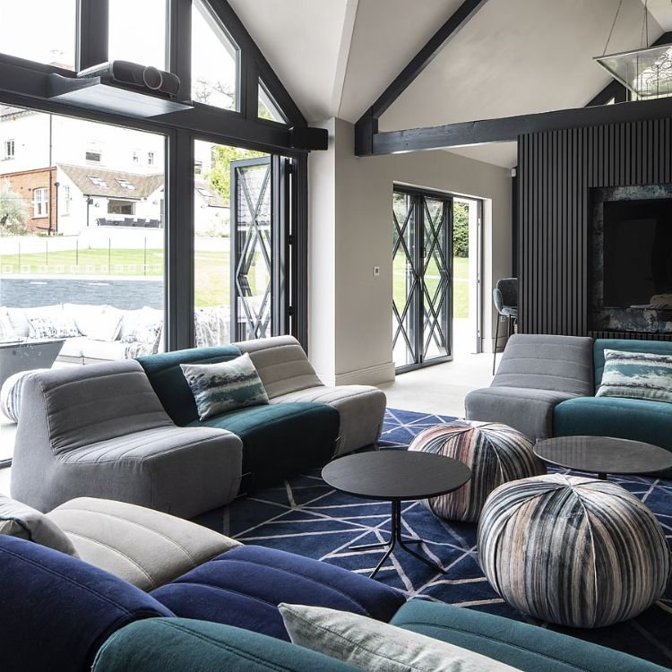
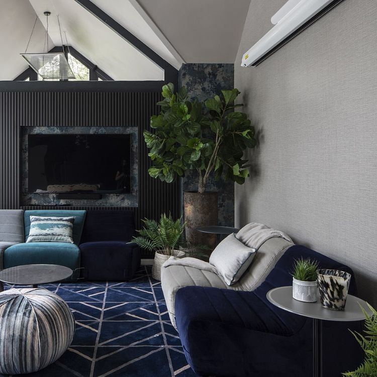
For example, you can see the living room pictures below for a bespoke project that we recently supplied furniture for. The designer went for a very unique and creative colour palette and while the sofas, rug and accessories are not matching, they still maintain a cohesive and coordinated look.
4. Not Considering Your Lifestyle
Certain aspects of your lifestyle need to be considered when buying new furniture.
For example, if you’re buying a new dining table and you host dinner parties frequently, then it would make more sense to go for an extended dining table. On the other hand, if you’re a small family and don’t host big dinners, then you can go for a small, compact and space-saving design.
Every furniture item that you choose should enrich your lifestyle instead of creating any sort of hindrance. Make these requirements clear to your salesperson, so they can help you find the appropriate products.
5. Overcrowding your Space with Too Much Furniture
Modern interior design is highly focused on minimalism, so it is best to avoid overcrowding and keep things as simple as possible. Of course, minimalistic does not have to be boring. You should feel free to play around with colours and textures, but this should be done while keeping the space clutter-free and neat.
According to our design team, the 70s are making a comeback, so you’ll be seeing a lot more colours, patterns and geometric prints in interior design. So we recommend incorporating these trends into your new design projects while maintaining a minimalist look.
When you’re working with expert interior designers, they will help you with space planning so every item of furniture has the appropriate amount of distance from the other. This ensures that your space feels airy and uncluttered.
6. Ignoring Comfort
When buying furniture that you’ll be using on a daily basis, such as beds or sofas, comfort should be the most important deciding factor as it directly impacts your health and posture.
Especially when making a big purchase, it never makes sense to invest in a furniture piece that does not make you feel relaxed.
7. Not Thinking About How You Will Use the Space
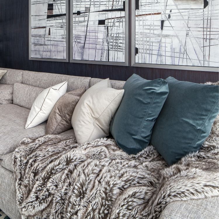
Furnishing a room becomes much easier when you keep track of your layers, as every room has multiple layers that include furniture, upholstery, flooring, accessories, fabrics, lighting and plants.
So create a mood board that you can use to analyse all the colours, patterns, materials and textures – this will help you focus on the details, consider the usage of every product and make better decisions.
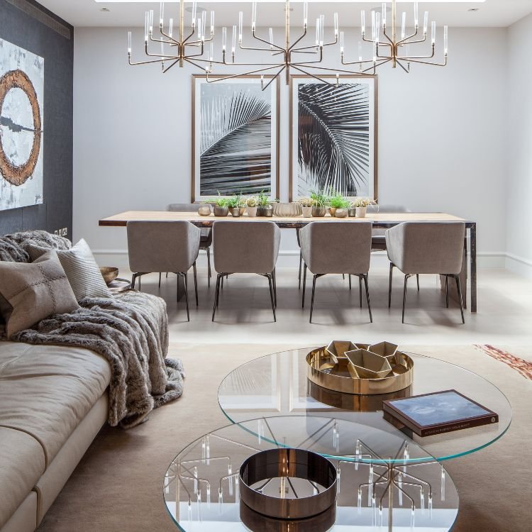
Take a look at this open plan living room from our award-winning, Elm Park, Kensington project, in collaboration with Rina Vastu. This space was furnished and carefully accessorised to ensure that all the layers come together in a practical and interesting manner rather than overshadowing each other.
8. Over-accessorizing
Apart from overcrowding, clients also often tend to go overboard with their accessories which can make the space look cluttered and small.
No matter what accessories you choose, remember to keep it simple. And make sure that you make good use of mirrors.
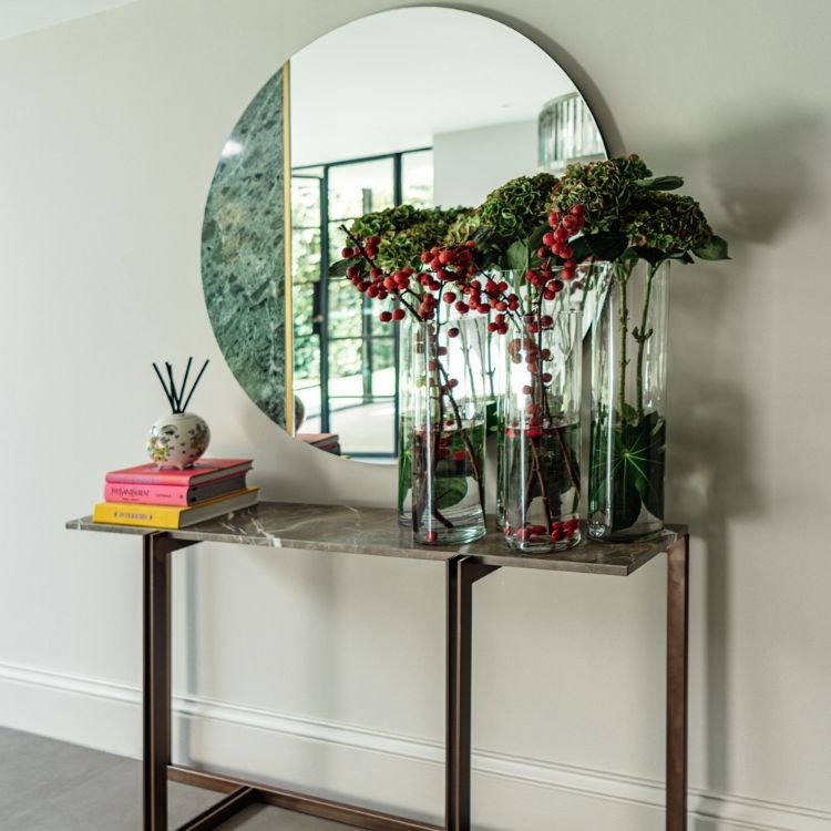
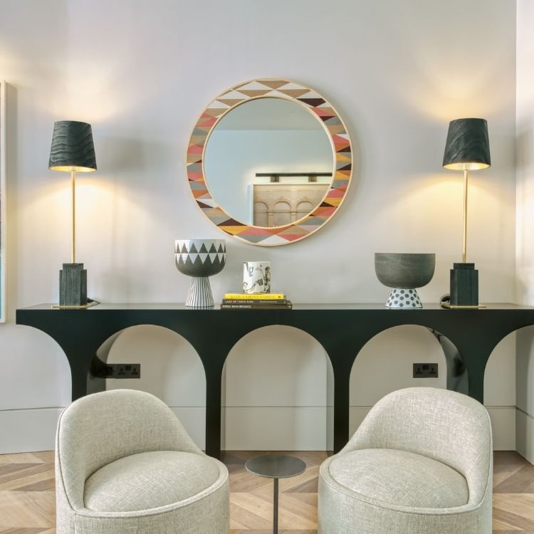
Mirrors are one of the most underrated accessories as people don’t fully understand their potential. Apart from creating the illusion of a bigger space, mirrors can also be used as wall art or to create a nice ambience by throwing natural light across the space.
To make the best use of the mirrors, our designers recommend putting them up at a spot where natural light falls directly on them, such as opposite or adjacent to a window. Similarly, placing a mirror in an empty hallway, over the fireplace or above the console table is a very simple but effective strategy to spruce up your space.
According to our senior designer Benjamin Ibanez, “For those who love a little glitz and glamour in your interior design, adding a modern mirror is exactly what you need to inject a touch of royal shine. I recommend using a statement piece that can catch the eye and create a focal point for your space.”
In Conclusion
We hope that these design tips have been helpful. Avoiding these mistakes when first designing your space will save you a lot of trouble in the long run. If you need advice or assistance in planning your design, our design team is always available. Get in touch for a free consultation – no strings attached.


